
Interior Colour Schemes For Your Home
Choosing colours for your home isn’t just about what looks nice on a paint swatch. The right mix can make a compact laundry feel bigger, a bathroom feel calmer or a kitchen feel instantly more inviting. It has a way of pulling a room together so it feels intentional, not just thrown together.
This guide walks you through ways to build a colour scheme that not only looks good but feels right for your home.
Why interior colour schemes matter
Colour plays a big part in how a room feels. It creates atmosphere, can sway your mood and changes how spacious or cosy a room seems. This is particularly important in bathrooms, laundries and kitchens, where the space should be both practical and comfortable for everyday use.
From supporting busy morning routines to family dinners, these hardworking spaces deserve a considered colour scheme so you can love them for years.
How to choose the right room colours
While it’s tempting just to pick your favourite shades, choosing the right colours for a room encourages you to balance what you want with what works. From lighting and layout to flooring and furniture, here’s what to consider when deciding on a colour scheme for your home that feels right.
Look at what’s already there
If you’re upgrading a pre-existing space, you need to start by looking at what you won’t be changing. Fixed features like floors, cabinets, vanities and furniture should guide your choices. Pull colours from these elements to create a considered style that suits your taste and the rest of your home.
Check the undertones of your fixed features and take note of whether it leans towards warm, cool or neutral. If, for example, you have white tiled floors, you’ve got a neutral enough base to go with whatever you want. But if you’ve got dark floorboards, you might want something lighter on the walls.
Factor in lighting and size
Speaking of lighting, it can also play a part in how colours look. Natural light can make colours look brighter and more vibrant, while artificial lighting might warm or cool the tones. You should check how your chosen colours look at different times of day, especially in rooms you’ll be spending plenty of time in.
The same sort of principle also applies to room size. Small rooms are easily overwhelmed by dark colours, but you’ll have more freedom in big spaces.
Decide the mood you want
What mood do you want to create? Are you after a calm, grounding space? Or do you prefer a bold, fun look? Your colour choices should reflect the atmosphere you want for the room.
Our sister brand TileCloud has a blog on colour psychology if you want to go deeper into this.
Interior design colours
When it comes to choosing colours for your home, understanding the impact each shade can have on mood helps you create the right feel for every room. Here’s a quick guide to colours and how they’re often used in interiors.
White
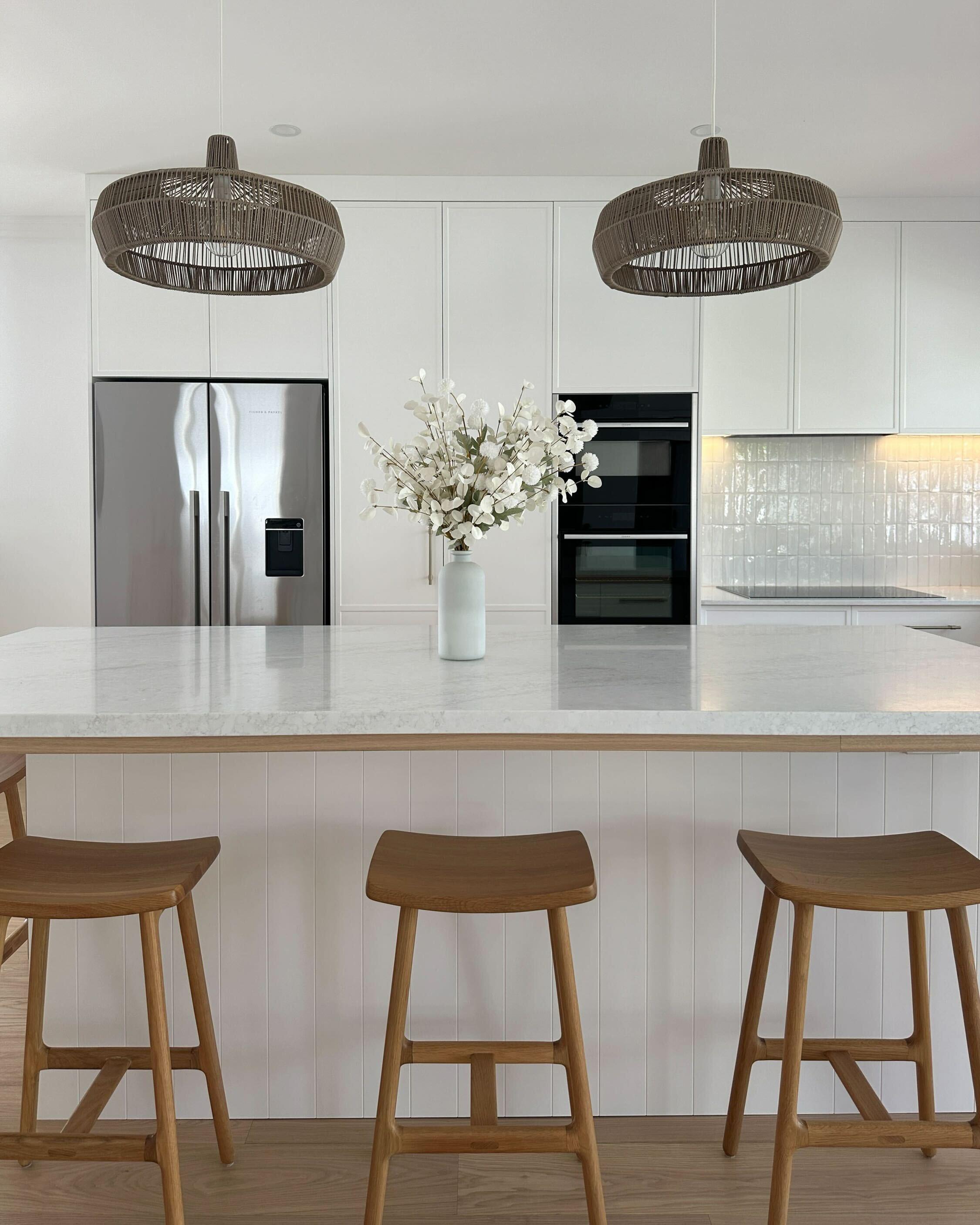
White’s a classic for a reason, it opens up and brightens a space by reflecting light. It’s a popular choice as a base in pretty much every room in the house, leaving space for you to experiment with pops of colour.
Blue
Blue is a calming and versatile colour, perfect for creating a peaceful atmosphere. It works well in bathrooms and bedrooms, where you want to feel relaxed. Light blues open up a space, and when used with white, it can lean into a Hamptons or coastal style.
Red
Hints of red liven up a space, which is great for communal areas like dining rooms or kitchens. As it’s a bold colour, smaller red accents will offer just the right amount of interest without overpowering the room.
Yellow
Yellow makes rooms feel warm, cheery and calm. It’s a great colour for just about any room, but especially kitchens and bedrooms. Softer yellows offer a gentle glow, while brighter shades can be used as fun accents.
Pink
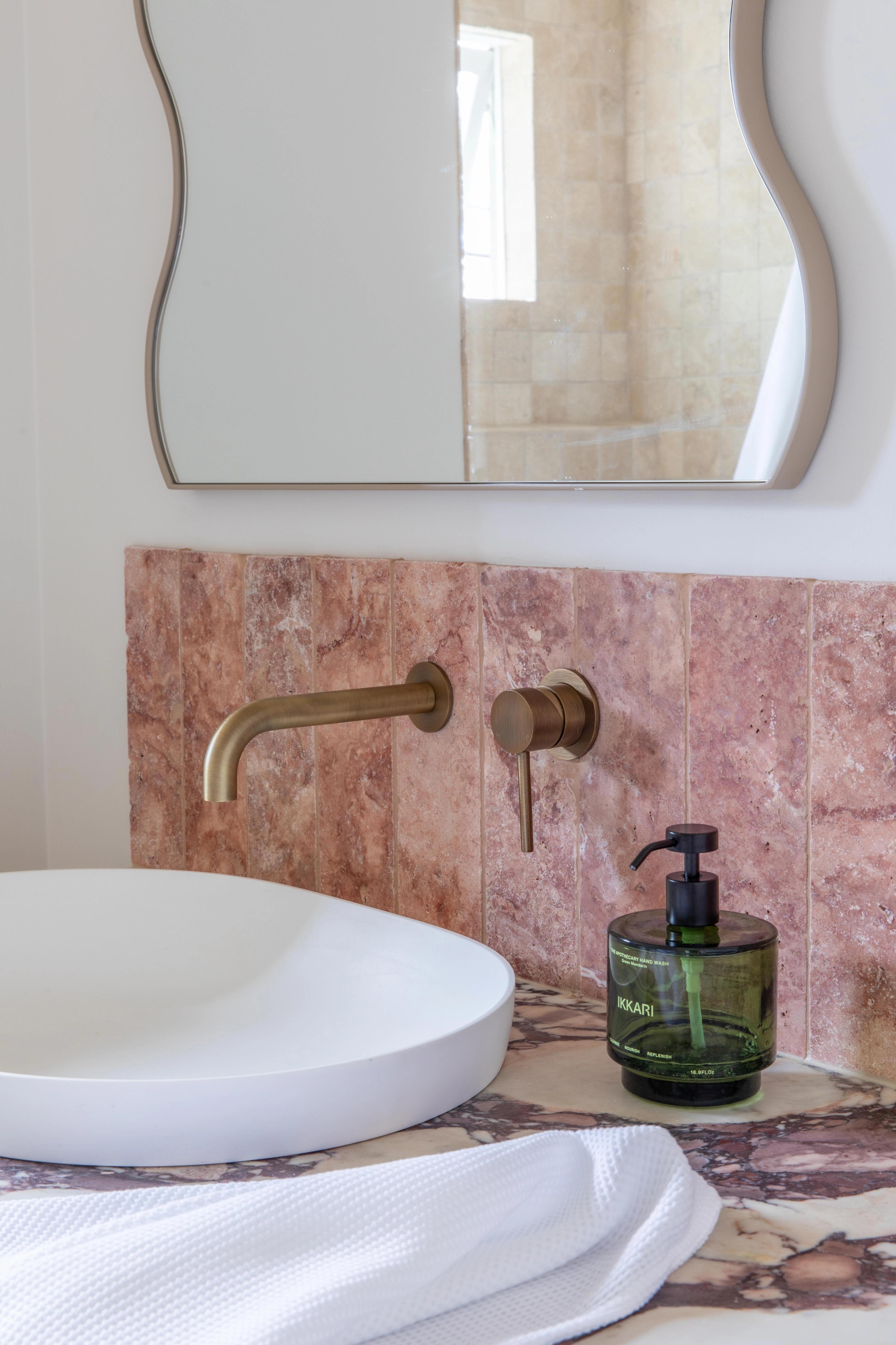
Pink doesn’t have to be loud. Dusty or muted pinks can make your home feel soft and cosy, especially when paired with natural materials like timber and rattan. Use it as an interesting splashback colour or on the walls with paint.
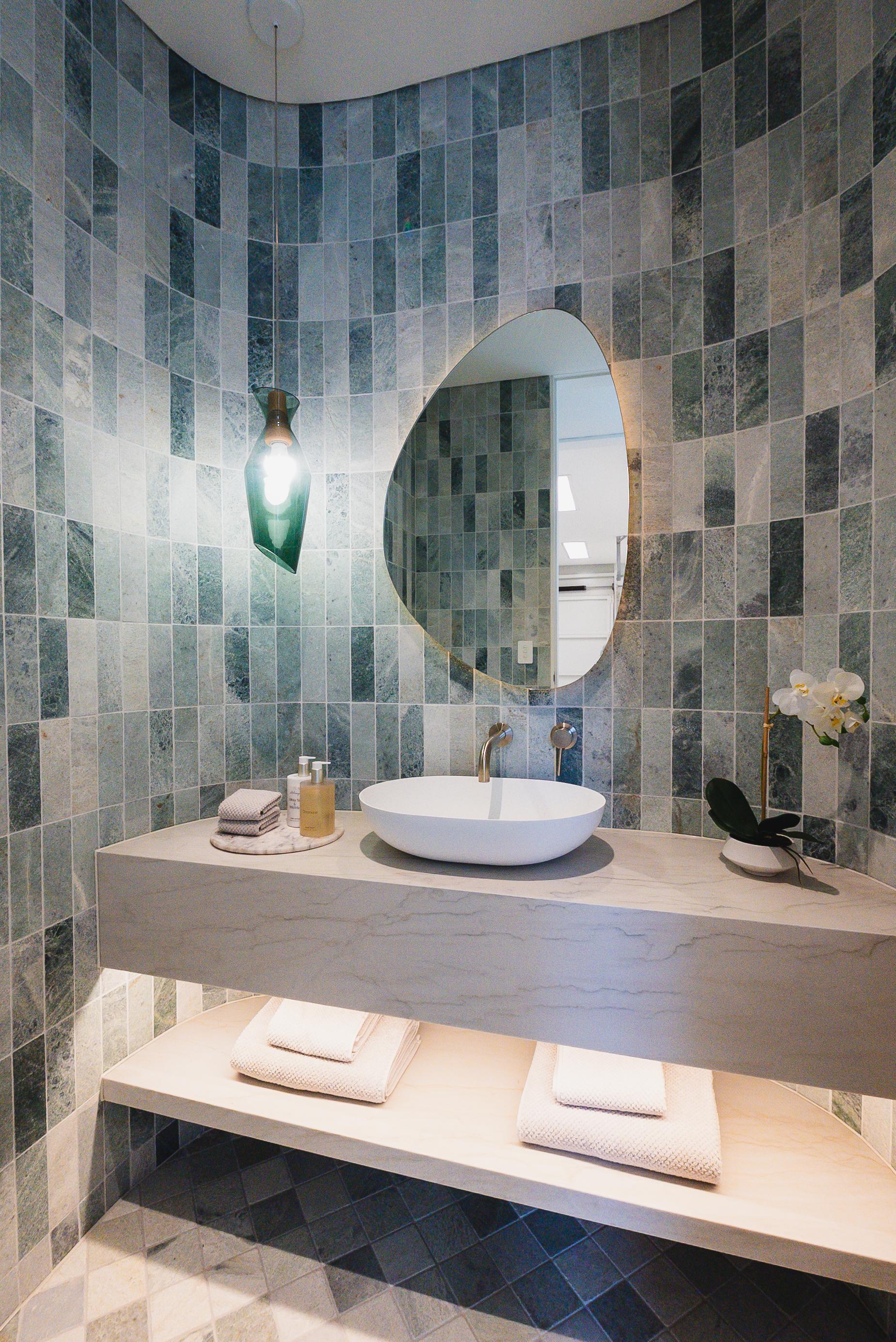
Green
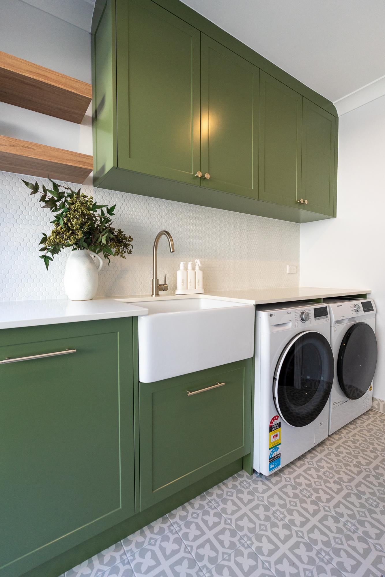
From olive and sage tones to dark forest green, this colour is a favourite for a reason. It can bring a natural element and sense of calm to your room. It looks best next to the natural brown tones you’d find in timber.
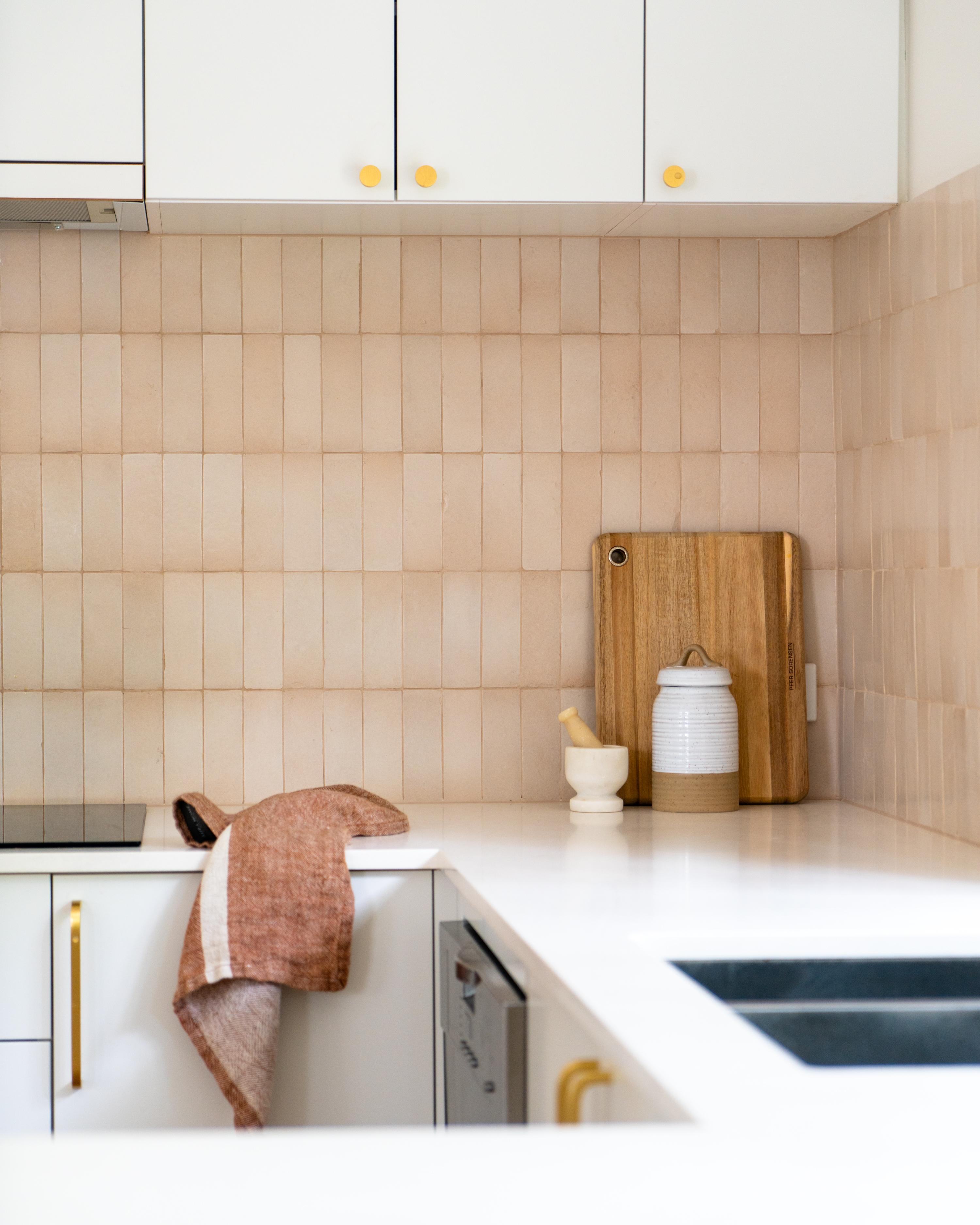
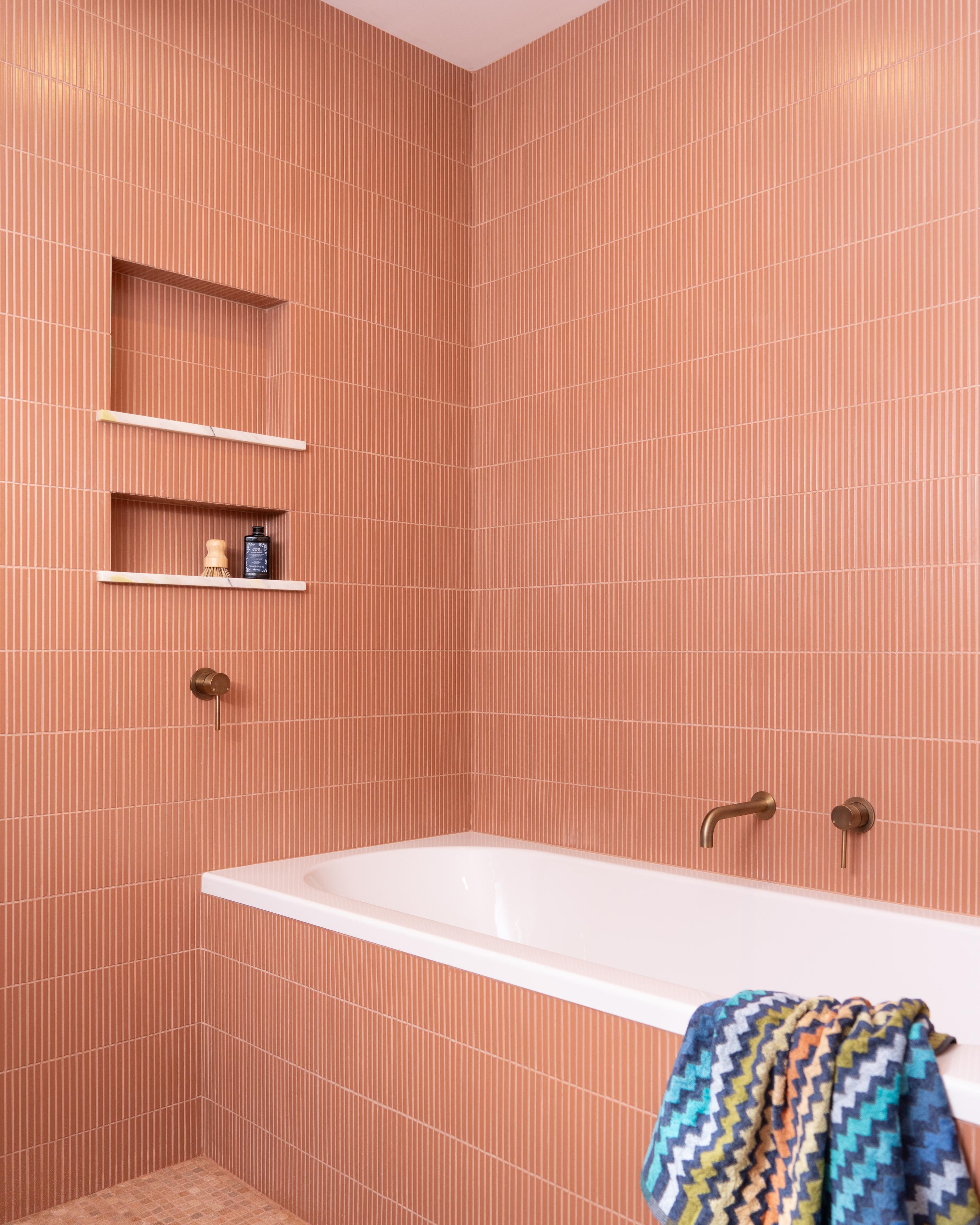
Orange
Shades of orange can range from bright, lively hues to warm terracotta. If you’re more of a fan of bright orange, use it as an accent colour. If you’re more into muted shades on floors and walls, you might be a fan of Mediterranean style.
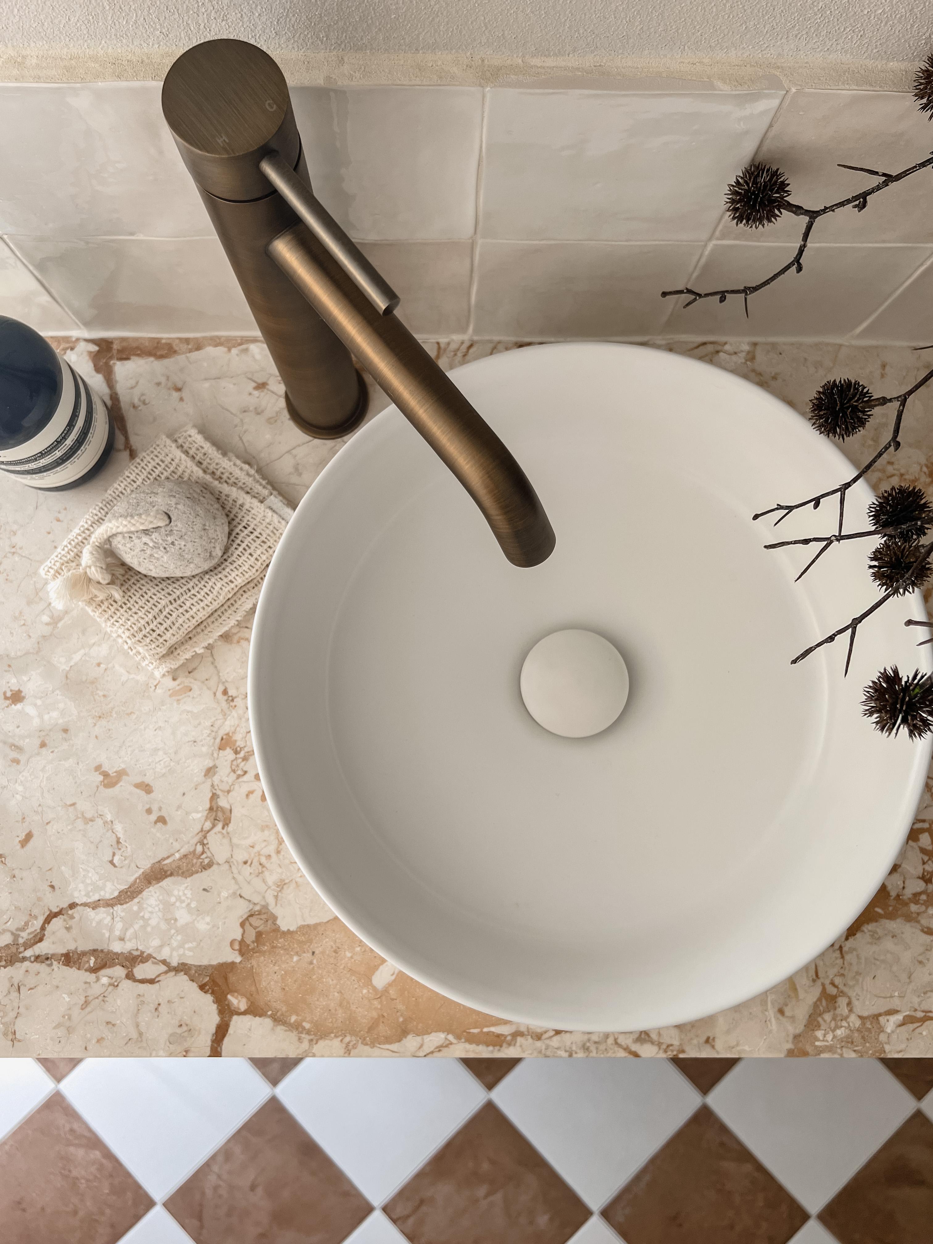
Brown
From chocolate brown to taupe and cream, there are so many shades of brown that it’s hard to know which to go for. Whatever you choose, you can count on it to bring in a natural feel and sense of cosiness.
Black
Black might sound bold, but it’s really just another neutral. Most people don’t use it as a base colour (you can if you want to!), but it works beautifully in smaller touches like furniture and tapware. Paired with white, it feels classic and timeless, and it’s a great way to add contrast to your room.
Tapware and hardware colours to match
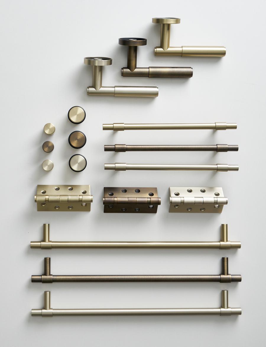
The colour and finish of your tapware are small details that can have a huge impact on the feel of a room. Whether you want fixtures that blend in or stand out, our range has options to suit any interior style.
Chrome
A classic, high-shine finish that works well in a range of spaces. Chrome is clean and versatile, and it tends to reflect surrounding colours, making it easy to match with most palettes.
Warm Brushed Nickel
Warm Brushed Nickel offers a softer, subtle warm look compared to polished metals. It pairs well with neutral or warm-toned palettes.
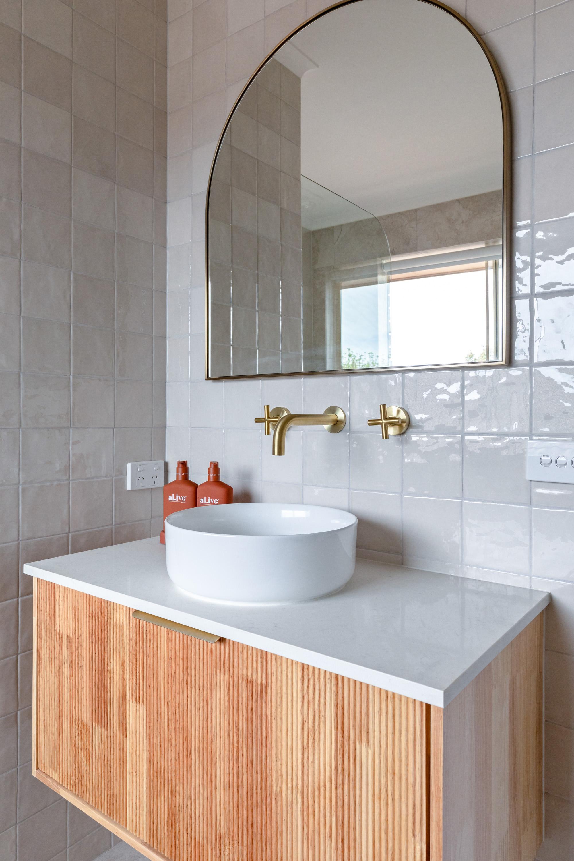
Brushed Brass
Brushed Brass brings warmth and texture to a space. It works well with both light and dark colour schemes, adding depth without overpowering the design.
Antique Brass
Antique Brass is a great pick for a more lived-in look in both modern and traditional homes. It adds character and balances neutral interior colour palettes.
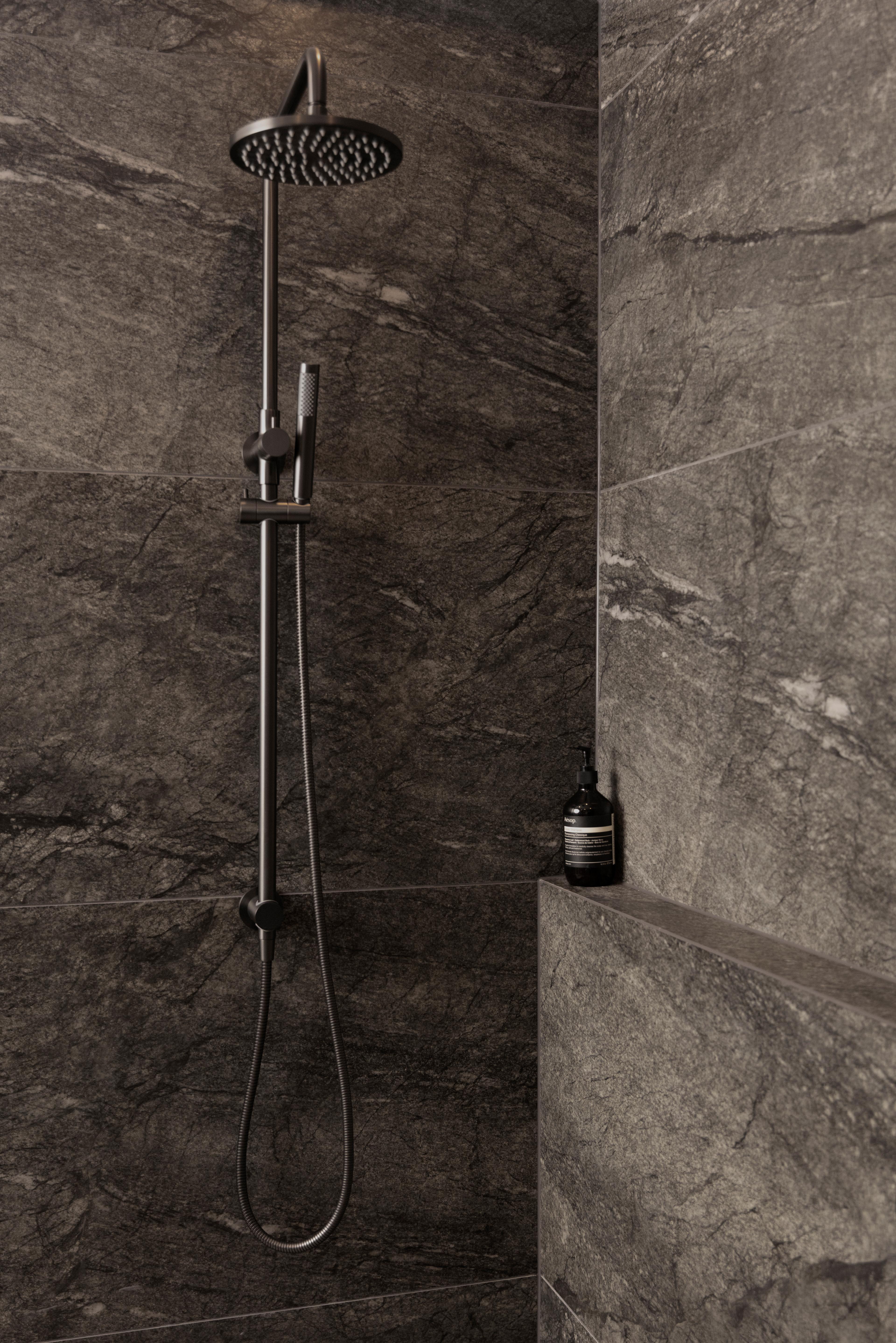
Gunmetal
Gunmetal is a darker, cooler-toned finish popular in modern, industrial or monochrome colour schemes. It’s great if you want something bold but less contrasting than matte black.
Matte Black
Matte Black tapware is modern and gives rooms contrast. It works well with both warm and cool palettes and helps frame features in the room.
Making the interior colour scheme choice
Picking colours isn’t just about paint on the walls. It’s about how your flooring, furniture, tiles and even small details like tapware sit together in the same space.
If you’re not sure how to balance it all, book a free design appointment with us. We’ll help you line up your colour choices with finishes like handles and tapware, so everything feels consistent without looking too matchy-matchy.

Layla is a creative at heart, with an Advanced Diploma in Interior Design and being the Senior Marketing and Ecommerce Coordinator here at Yabby she has a passion for staying up to date with the latest trends within the industry. Known for going down a rabbit hole on Pinterest and being a sucker for a good mood board to kick off any project.